Xamarin Forms Absolute And Relative Layout
In Xamarin Forms, layouts are used to position elements in the page.
There are multiple layouts available like stack layout, grid layout, table layout, absolute layout and relative layout.
Stack layout is straight to grasp the concept, we stack elements one by one horizontally or vertically.
Grid layout is also straight forward, we define rows and columns and we place the elements by indicating the row index and column index.
On the other hand, absolute layout and relative layout isn’t that straight forward because in Xamarin it is NOT the same as positions in CSS.
So today, we will see how and when we can use absolute layout and/or relative layout in our advantage.
- Absolute layout
- Relative layout
## 1. Absolute layout
The first thing to understand is that absolute layout has nothing to do with CSS absolute position.
In Xamarin Forms. absolute layout allows us to position elements in the page by precising X, Y, width and height of the element.
Using these values we can freely place elements anywhere in the layout.
It also allows us to specify which values are proportional (expressed as a percentage of the container width/height).
Example
Let’s see an example. If we decide to place an element at (0, 0) we would write:
1
2
3
4
5
6
7
8
9
10
11
type AbsolutePageExample() as self =
    inherit ContentPage(Title = "Absolute example")

    let layout =
        let layout = new AbsoluteLayout()
        let box  = new BoxView(BackgroundColor = Color.Blue)
        layout.Children.Add(box,  new Rectangle(0., 0., 0.25, 0.25), AbsoluteLayoutFlags.All)
        layout

    do
        self.Content <- layout
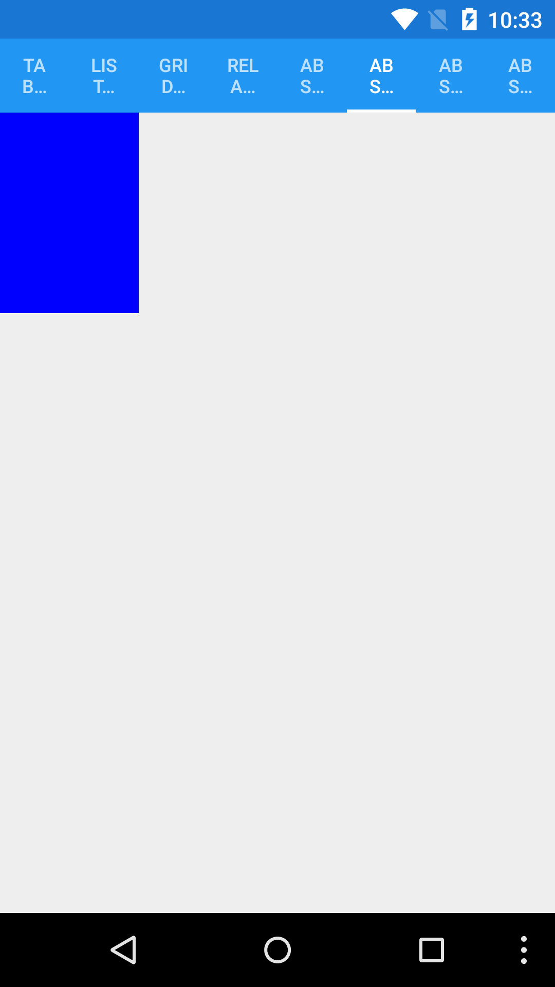
This will result in the following:
1
layout.Children.Add(box,  new Rectangle(0., 0., 0.25, 0.25), AbsoluteLayoutFlags.All)
In the Add function, we pass the element - a box - and we pass Rectangle which defines the area which defines the visibility of the box.
AbsoluteLayoutFlags is a flag which specify which values are proportional. All for all values are proportional: 0 for X, 0 for Y, 25% of the container width for width and 25% of the container height for height.
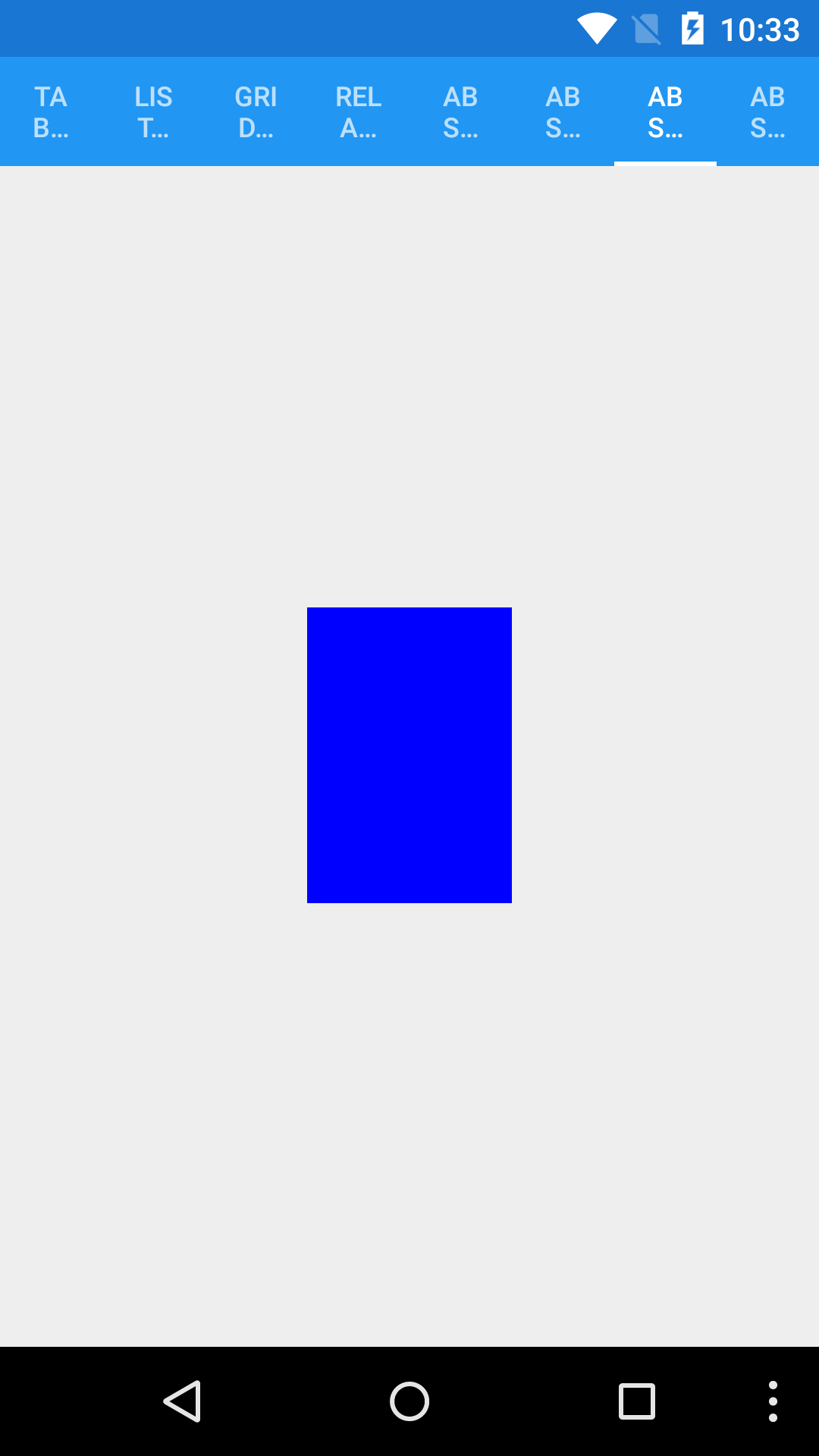
Now let’s see if we use X:0.5 and Y:0.5.
1
2
3
4
5
6
7
8
9
10
11
type AbsolutePageExample() as self =
    inherit ContentPage(Title = "Absolute example")

    let layout =
        let layout = new AbsoluteLayout()
        let box  = new BoxView(BackgroundColor = Color.Blue)
        layout.Children.Add(box,  new Rectangle(0.5, 0.5, 0.25, 0.25), AbsoluteLayoutFlags.All)
        layout

    do
        self.Content <- layout
The box is now centered in the middle of the page.
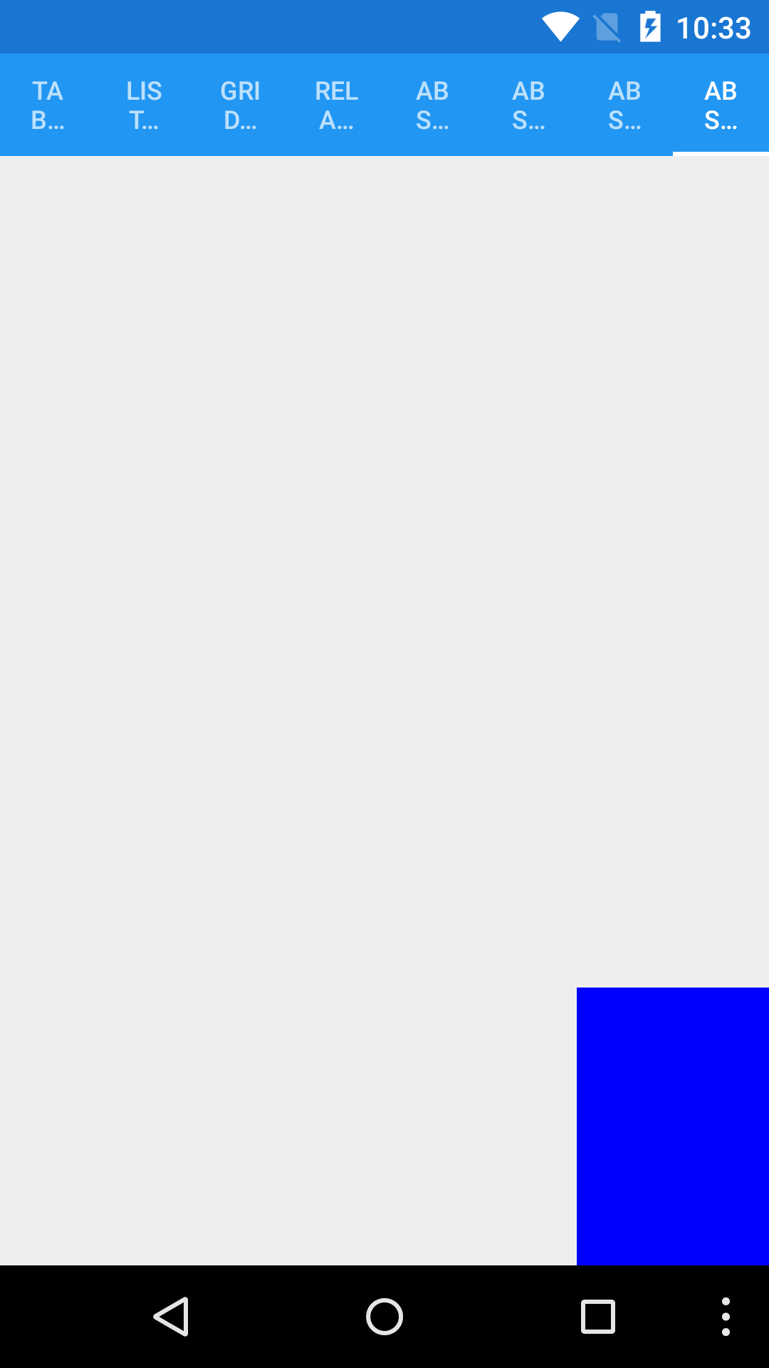
Let’s see if we use X:1 and Y:1.
1
2
3
4
5
6
7
8
9
10
11
type AbsolutePageExample() as self =
    inherit ContentPage(Title = "Absolute example")

    let layout =
        let layout = new AbsoluteLayout()
        let box  = new BoxView(BackgroundColor = Color.Blue)
        layout.Children.Add(box,  new Rectangle(1., 1., 0.25, 0.25), AbsoluteLayoutFlags.All)
        layout

    do
        self.Content <- layout
The box is now at the bottom right.
When I first encountered that, it confused me. Why for 1:1, the element isn’t out of the screen?
What happened?
From what we observe, at (0, 0), the box is at the top left. At (0.5, 0.5), it is at the center. At (1, 1), it is at the bottom right.
What happened is that while X and Y were changed, the anchor of the element changed too. In other words, while we changed the X and Y, the (0, 0) point defining the placemenet of the box changed.
Why does the anchor changes? It changes to guaranty that the element will always be on the screen and it makes it easy to position elements at top, middle and bottom or left, miggle and right.
What can I do with it?
The way the absolute layout changes the anchor makes things very easy in scenarios where we only need to place two elements. Placing two elements vertically or horizontally becomes effortless.
If we need to divide the view in 1/4 - 3/4 vertically, we would do:
1
2
layout.Children.Add(topBox,new Rectangle(0., 0., 1., 0.25), AbsoluteLayoutFlags.All)
layout.Children.Add(bottonBox,new Rectangle(0., 1., 1., 0.75), AbsoluteLayoutFlags.All)
This would mean, place topBox from the top and with a width of 25% and place bottomBox from the bottom with a width of 75%.
To divide the view in 1/4 - 3/4 horizontally, we would do:
1
2
layout.Children.Add(topBox,new Rectangle(0., 0., 0.25, 1.), AbsoluteLayoutFlags.All)
layout.Children.Add(bottonBox,new Rectangle(1., 0., 0.75, 1.), AbsoluteLayoutFlags.All)
Knowing that, we can use absolute layout to compose more sophisticated screens by embedding absolute layout into other absolute layout and dividing into two parts each layouts.
2. Relative layout
Relative layout is used, as it names indicate it, to place a view in relation to something else - either another view or the parent view.
Here is a simple example of a relative layout.
1
2
3
4
5
6
7
8
9
10
11
12
13
14
15
16
17
18
19
20
21
22
let layout =
    let layout = new RelativeLayout()

    let box = new BoxView(BackgroundColor = Color.Blue)
    layout.Children.Add(
        box,
        Constraint.RelativeToParent(fun parent -> parent.X),
        Constraint.RelativeToParent(fun parent -> parent.Y),
        Constraint.RelativeToParent(fun parent -> (parent.Width * 25.) / 100.),
        Constraint.RelativeToParent(fun parent -> (parent.Height * 25.) / 100.)
    )

    let box2 = new BoxView(BackgroundColor = Color.Fuchsia)
    layout.Children.Add(
        box2,
        Constraint.RelativeToView(box, fun parent view -> view.X + view.Width),
        Constraint.RelativeToView(box, fun parent view -> view.Y + view.Height),
        Constraint.RelativeToParent(fun parent -> (parent.Width * 25.) / 100.),
        Constraint.RelativeToParent(fun parent -> (parent.Height * 25.) / 100.)
    )

    layout
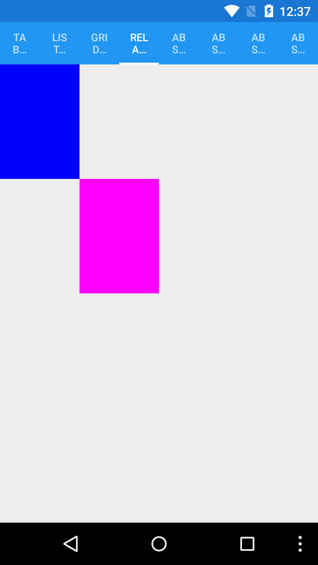
box is placed relative to its parent (the page itself) using Constraint.RelativeToParent where we define X, Y, width and height.
And box2 is placed relative to box for its X and Y with Constraint.RelativeToView and relative to its parent for width and height.
Relative layout is useful when we need to place element precisely on the screen.
All the samples are available on my GitHub repository https://github.com/Kimserey/XamarinFormsDefaultLayoutSample.
Conclusion
When I first started to use Xamarin.Forms, it took me a while to understand that Absolute layout in Xamarin is not the same as Absolute positioning in HTML/CSS. After understanding that, I started to look into how it really worked rather than assuming how it worked and this post basically describe what I have learnt. In my opinion, Absolute layout is very useful for proportional layouts. It’s extremely useful to separate the screen in two sections and it is what I always use it for. I hope this post helped to demystify Absolute layout and Relative layout let me know if you have any question by leaving a comment here on hit me on Twitter https://twitter.com/Kimserey_Lam. See you next time!
Other posts you will like!
- Have you ever wondered what is required to publish an Android app on Google Play store? Here are the steps - https://kimsereyblog.blogspot.co.uk/2016/09/publish-your-android-app-to-google-play.html
- Transform your WebSharper web app into an Android app - https://kimsereyblog.blogspot.co.uk/2016/05/transform-your-websharper-web-app-into.html
- Nice features and tricks with SQLite - https://kimsereyblog.blogspot.co.uk/2016/06/nice-features-and-tricks-with-sqlite.html


