Create Animated Menu Websharper

WebSharper.UI.Next exposes a set of functions to animate elements on the page. Today we will see how we can use these functions to create an animated menu with UI.Next.
The documentation for animation can be found here.
The documentation has links to multiple important components of an animation.
In this tutorial, we will only use the Anim.Simple. It is a function defined in Anim module which helps in creating an animation.
In this post, we will see how to:
- Compose an animation in WebSharper
- Build the animated menu
Compose an animation in WebSharper
An animation is composed by the following components:
- An abstraction of animate
Anim<T> - An abstraction of a transition
Trans<T> - A duration
- An interpolation which uses a normalised time
- An easing method
The two types which are used together to form an animation are Anim<T> and Trans<T>.
Anim
Anim<T> defines an animation between two variables.
For example if A is our initial value and B is the end value, It helps in defining how the value changes from A to B, what kind of curve (easing) does the values follow and how long it takes to go from A to B.
It is created with a duration, an interpolation and an easing function.
DurationinTimeis the amount of millisecond that it will take to go from A to B.Interpolationdefines how the values in between A and B are computed based on a normalised time (the duration normalised to 0-1).Easing functionis a function which specify the curve followed by the values from A to B, we will use the one defined by default in WebSharper which isCubicInOut.CubicInOutbasically defines a curve which starts fast, slows down in middle and accelerates at the end.
Trans
Trans<T> defines the transitions associated with the page elements.
For example if we are animating a div based on its width,
Trans allows us to create an animation on the width when the div is inserted in the dom, when the div is removed from the dom and when the width itself is changed.
Trans exposes three functions Trans.Change, Trans.Enter and Trans.Exit.
Trans.Changeanimates the changes of value observed on the view given.Trans.Enteranimates the element when the element enters the scene.Trans.Exitanimates the element when the element exits the schene.Trans.Trivialcreates an empty transition.Trans.Createis a shorthand forTransTrivial() |> Trans.Change.
Intuition
To get a better intuition on how to compose Anim and Trans, we will see an example.
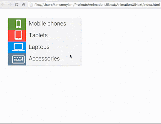
Here is a preview of the example we will build for this first part.
As mentionned earler, we will use Anim.Simple through out this tutorial.
Here is the signature of Anim.Simple:
1
static member Simple : Interpolation<'T> -> Easing -> dur: Time -> startValue: 'T -> endValue: 'T -> Anim<'T>
It takes in interpolcation, easing, a duration, a start and end value and returns an Anim.
We start first by defining a global anim.
1
2
let anim = Anim.Simple Interpolation.Double Easing.CubicInOut 1000.
//val anim : double -> double -> Anim<double>
We created an animation which interpolates double so T = double, uses a CubicInOut function and last for 1 second.
From here we can already see that double -> double is meant to be from A to B or B to A.
For our example, the opacity will go from 0. to 1. to show and 1. to 0. to hide, translate will go from 0. to 5. (in em) to slide right and 5. to 0. to slide back left.
To orchestrate the animation, we need to create a transition. In this example, we animate on entry and exit of the element.
1
2
3
4
let trans =
    Trans.Trivial()
    |> Trans.Enter (fun v -> anim 0. v)
    |> Trans.Exit  (fun v -> anim v 0.)
We animate from 0. to v and on exit from v. to 0.. v allows us to customise and reuse this transition as it can now be used for both, the translation and the opacity.
To use a transition, we will place it as an attribute of an element here of a h1.
1
2
3
4
5
6
7
8
9
10
11
12
13
h1Attr [ Attr.AnimatedStyle
         <| "transform"
         <| trans
         <| View.Const 5.
         <| sprintf "translate(%fem)"

         Attr.AnimatedStyle
         <| "opacity"
         <| trans
         <| View.Const 1.
         <| sprintf "%f" ]

       [ text "Hello world." ]
To bind an animation to an element, we use Attr.AnimatedStyle which changes a style specified using a transition where each value is translated to a string and assigned to the style.
With this in place, the animation is done. Every time the element is inserted into the dom, it will slide and show and when removed, slide back and become transparent.
1
2
3
4
5
6
7
8
9
10
11
12
13
14
15
16
17
18
19
20
21
22
23
24
25
26
27
28
29
30
31
32
33
34
35
36
37
38
39
40
[<JavaScript>]
module SimpleAnimation =

    let anim = Anim.Simple Interpolation.Double Easing.CubicInOut 500.

    let trans =
        Trans.Trivial()
        |> Trans.Enter (fun v -> anim 0. v)
        |> Trans.Exit  (fun v -> anim v 0.)

    let rvShow = Var.Create true

    let main =
        [ Doc.Button
          <| "Toggle"
          <| [ attr.style "display: block;" ]
          <| fun () -> rvShow.Value <- not rvShow.Value
          :> Doc

          rvShow.View
          |> View.Map (fun show ->
            if show then
                h1Attr [ Attr.AnimatedStyle
                         <| "transform"
                         <| trans
                         <| View.Const 5.
                         <| sprintf "translate(%fem)"

                         Attr.AnimatedStyle
                         <| "opacity"
                         <| trans
                         <| View.Const 1.
                         <| sprintf "%f" ]

                    [ text "Hello world." ] :> Doc
            else
                Doc.Empty)
          |> Doc.EmbedView ]
        |> Doc.Concat
        |> Doc.RunById "main"
Build an animated menu
Now that we understand how to build animations, we have enough tools to build a nice animated menu.
This menu has three visible animations on a selection:
- The button selected slides up
- The other buttons slide out
- The submenu appears
And the opposite happens when going back:
- The button slides back to its original position
- The other buttons slide back in
- The submenu disappears
We start first by defining a transition that we will use accross the whole menu.
1
2
3
4
5
6
let transition initial =
    let anim time = Anim.Simple Interpolation.Double Easing.CubicInOut time
    Trans.Trivial()
    |> Trans.Change (anim 350.)
    |> Trans.Enter (fun v -> anim 200. initial v)
    |> Trans.Exit (fun v -> anim 200. v initial)
It is almost the same as we seen earlier except that this function act as a generator of transition given an initial value.
How does it work?
To animate the buttons, we will identify its state. Every time the state changes, we will animate all the buttons and depending on whether the buttons are selected or not, we will attribute different value to the styles.
Define the models
Let’s start first by defining the state.
1
2
3
4
5
6
7
8
9
10
11
12
13
14
15
16
17
18
19
20
21
22
23
24
25
26
27
28
29
30
31
type State = {
        Opacity: double
        Position: Position
        IsSelected: bool
    } with
        static member hide x =
            { x with Opacity = 0. }
        static member show x =
            { x with Opacity = 1. }
        static member moveUp x =
            { x with Position = { x.Position with Top = x.Position.Top - 1. } }
        static member moveUpN n x =
            { x with Position = { x.Position with Top = x.Position.Top - (float n * 1.) } }
        static member moveDown x =
            { x with Position = { x.Position with Top = x.Position.Top + 1. } }
        static member moveDownN n x =
            { x with Position = { x.Position with Top = x.Position.Top + (float n * 1.) } }
        static member moveLeft x =
            { x with Position = { x.Position with Left = x.Position.Left - 1. } }
        static member moveRight x =
            { x with Position = { x.Position with Left = x.Position.Left + 1. } }
        static member select x =
            { x with IsSelected = true }
        static member unselect x =
            { x with IsSelected = false }
        static member create() =
            { Opacity = 1.; Position =  { Top = 0.; Left = 0. }; IsSelected = false }
    and Position = {
        Top: double
        Left: double
    }
The state defines the opacity, the position Top/Left represents the button position for example with Position.Top, 0 would be the 0px, 1 would be (1 * height)px, etc..
I have also added some helper functions to hide, show, moveDown, select, etc.. which simply set - increase - decrease the value of the state.
Next we can create our button:
1
2
3
4
5
6
7
8
9
10
11
12
13
14
15
16
type Button = {
    Title: string
    Icon: string
    HexColor: string
    OnClick: unit -> unit
    SelectedClass: string
    State: Var<State>
} with
    static member create() = { Title = ""; Icon = ""; HexColor = ""; OnClick = ignore; State = Var.Create (State.create()); SelectedClass = "" }
    static member setTitle title x = { x with Title = title }
    static member setIcon icon x = { x with Icon = icon }
    static member setColor color x = { x with HexColor = color }
    static member setState state x = { x with State = state }
    static member onClick action x = { x with OnClick = action }
    static member setSelectedClass cls x = { x with SelectedClass = cls }
    static member render x = ???
Note that the state is a reactive variable of Var<State> which will be use to update the state of the button and also for other elements to be notified by the changes in the state of each buttons.
render is a function which changes the button to a doc. It is defined as followed:
1
2
3
4
5
6
7
8
9
10
11
12
13
14
15
16
17
18
19
20
21
22
23
24
25
26
27
28
29
30
31
32
33
34
35
36
37
38
static member render x =
    let left (state: State) = state.Position.Left * 300.
    let top (state: State)  = state.Position.Top * 48.
    let opacity (state: State) = state.Opacity

    let rvHover = Var.Create false

    divAttr [ attr.classDyn ((rvHover.View, x.State.View)
                                ||> View.Map2 (fun h s -> if h || s.IsSelected then "menu-button " + x.SelectedClass else "menu-button"))
              on.click (fun _ _ -> x.OnClick())
              on.mouseOver(fun _ _ -> Var.Set rvHover true)
              on.mouseOut (fun _ _ -> Var.Set rvHover false)

              Attr.AnimatedStyle
              <| "opacity"
              <| transition 1.
              <| View.Map opacity x.State.View
              <| sprintf "%f"

              Attr.AnimatedStyle
              <| "left"
              <| transition 0.
              <| View.Map left
              <| x.State.View
              <| sprintf "%fpx"

              Attr.AnimatedStyle
              <| "top"
              <| transition 0.
              <| View.Map top
              <| x.State.View
              <| sprintf "%fpx" ]

            [ divAttr [ attr.style (sprintf "background-color:%s;" x.HexColor)
                        attr.``class`` "menu-button-icon" ]
                      [ iAttr [ attr.``class`` (sprintf "fa %s fa-2x fa-fw" x.Icon) ] [] ]
              divAttr [ attr.``class`` "menu-button-text" ]
                      [ text x.Title ] ]
left, top and opacity are selectors used by View.Map which changes the value of the state to a usable css style value.
For example, left multiplies the value by 300 which is the width of the buttons.
We also bind our three transitions:
1
2
3
4
5
Attr.AnimatedStyle
<| "opacity"
<| transition 1.
<| View.Map opacity x.State.View
<| sprintf "%f"
The button will disappear when the State.Opacity turns to 0.
1
2
3
4
5
6
Attr.AnimatedStyle
<| "left"
<| transition 0.
<| View.Map left
<| x.State.View
<| sprintf "%fpx"
The button will move left or right by n * 300px depending on State.Position.Left. Same applies for top.
Build the menu
We can now define our buttons using the Button type.
1
2
3
4
5
6
let mobileBtn =
    Button.create()
    |> Button.setIcon "fa-mobile"
    |> Button.setTitle "Mobile phones"
    |> Button.setColor Colors.green
    |> Button.setSelectedClass "menu-button-is-selected-green"
And repeat the same creation process for all the buttons.
After all the buttons are created, we can create the animation of the selection of the mobileBtn.
1
2
3
4
5
6
let mobile() =
    if not mobileBtn.State.Value.IsSelected then
        Var.Set mobileBtn.State       (mobileBtn.State.Value |> State.select)
        Var.Set tabletBtn.State       (tabletBtn.State.Value |> State.moveLeft |> State.hide)
        Var.Set laptopBtn.State       (laptopBtn.State.Value |> State.moveLeft |> State.hide)
        Var.Set accessoriesBtn.State  (accessoriesBtn.State.Value |> State.moveLeft |> State.hide)
This specify how to animate the button. When mobile is selected, all other buttons moveLeft and hide whereas the mobileBtn becomes selected.
We also repeat the same for each button. Now we can defined how to show the content.
1
2
3
4
5
6
7
8
9
10
11
12
13
14
let mobile =
    divAttr [ attr.``class`` "menu-content"
              Attr.AnimatedStyle "opacity" (transition 0.) (View.Const 1.) (sprintf "%f") ]
            [ divAttr [ attr.``class`` "menu-content-back"
                        on.click (fun _ _ ->
                            Var.Set mobileBtn.State       (mobileBtn.State.Value |> State.unselect)
                            Var.Set tabletBtn.State       (tabletBtn.State.Value |> State.moveRight |> State.show)
                            Var.Set laptopBtn.State       (laptopBtn.State.Value |> State.moveRight |> State.show)
                            Var.Set accessoriesBtn.State  (accessoriesBtn.State.Value |> State.moveRight |> State.show)) ]
                        [ text "‹" ]
              divAttr [ attr.``class`` "menu-content-links" ]
                      [ div [ text "Sim free" ]
                        div [ text "Iphone" ]
                        div [ text "Samsung" ] ] ]
The content shows the submenu and a back button which revert back all the position of the buttons. It brings back the main menu by using moveRight and show on the buttons and unselect the previously selected button.
We also do the same for each content and lastly the only remaining step is to bind everything together and show it on the page.
1
2
3
4
5
6
7
8
9
10
11
12
13
14
15
16
17
18
19
20
21
22
23
24
25
26
27
28
29
30
31
32
33
let (<*>) f m = m |> View.Apply f

let main =
    divAttr [ attr.``class`` "menu" ]
            [ mobileBtn
              |> Button.onClick Selection.mobile
              |> Button.render

              tabletBtn
              |> Button.onClick Selection.tablet
              |> Button.render

              laptopBtn
              |> Button.onClick Selection.laptop
              |> Button.render

              accessoriesBtn
              |> Button.onClick Selection.accessories
              |> Button.render

              View.Const(fun (sm: State) (st: State) (sl: State) (sa:State) ->
              if sm.IsSelected      then Content.mobile :> Doc
              else if st.IsSelected then Content.tablet :> Doc
              else if sl.IsSelected then Content.laptop :> Doc
              else if sa.IsSelected then Content.accessories :> Doc
              else Doc.Empty)
              <*> mobileBtn.State.View
              <*> tabletBtn.State.View
              <*> laptopBtn.State.View
              <*> accessoriesBtn.State.View

              |> Doc.EmbedView ]
    |> Doc.RunAfterById "main"
We render all the buttons and render the right submenu when any of the button is selected.
We use <*> as a way to apply all the View<T> to the main function in View.Const.
It is a nice way to avoid dealing with abstractions and focusing on the main function which manipulates directly the underlying types.
1
2
3
View<C> =   View<A -> B -> C>
            <*> View<A>
            <*> View<B>
We then end up with a nice animated menu. The full source code is available here https://github.com/Kimserey/AnimationTest.
Conclusion
Today we saw how to use WebSharper animation. We used simple building blocks given by WebSharper to make a nice animated menu. Hope you enjoyed reading this tutorial and like always if you have any comments, you can contact me here or on twitter @Kimserey_Lam. Thanks for reading!