Figma Color Palette
Last week we talked about Figma auto layout and how it allowed us to automatically place elements in a design. In today’s post, we will look at how we can define a color palette which can then be used throughout our design.
Color Usage
Colors can be added via the Fill option on elements. Any element can have a color, a shape, frame, and component, will have their backgrounds filled with the color selected while a group would apply a single color to all elements within the group.
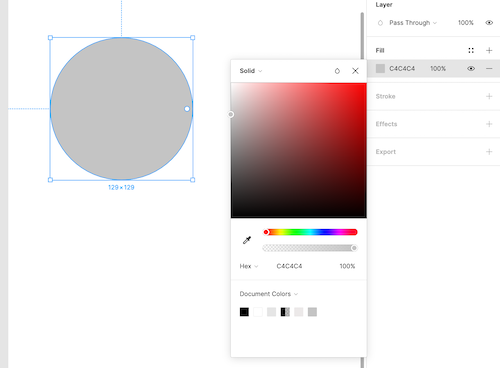
Other than selecting a color, we are able to save the color in a Color Styles list.
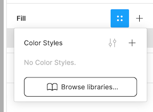
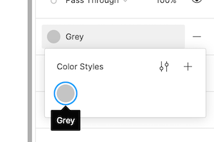
For example we name the color Grey and save it in the color style, then from now on we are able to directly select Grey from the color styles list.
Color Palette
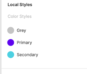
Using the color styles, we are then able to create a color palette. The first colors to pick are the primary and secondary color. Primary and secondary color will be the color representing the brand, therefore it is important to choose them based on the brand colors.
The primary color is the color which will be displayed the most across the application. The secondary color is the accent color which can be used to draw attention, on call to action for example.
Here we use Material color tool to find a primary and secondary color:
- Primary #6002ee
- Secondary #4dd0e1
And we use the Material color tool to create lighter and darker variation of the colors.
- Primary Light #9c47ff
- Primary Dark #0000ba
- Secondary Light #88ffff
- Secondary Dark #009faf
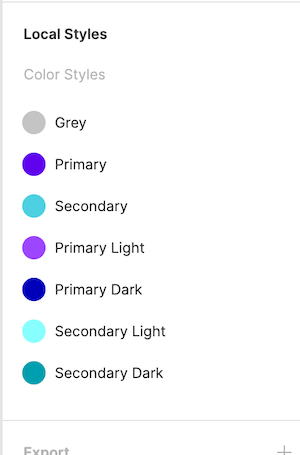
Lastly we create our color palette in a frame to quickly reference from our design.
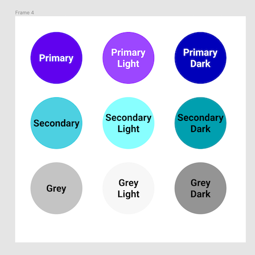
Using this color palette, we are now able to build element and fill them with common colors. And when we update the palette, all elements will be updated all together!
Conclusion
Today we looked at how we could create a color palette to define the colors in our application.


