Understand Bootstrap Flexbox

Last week we saw how to setup vscode to compile sass. Today we will see how we can compile bootstrap sass files together with our own sass and define a grid layout for the collapsed nav in smaller screen using flexbox.
- Flexbox
- Bootstrap sass media directive
- Build the nav style
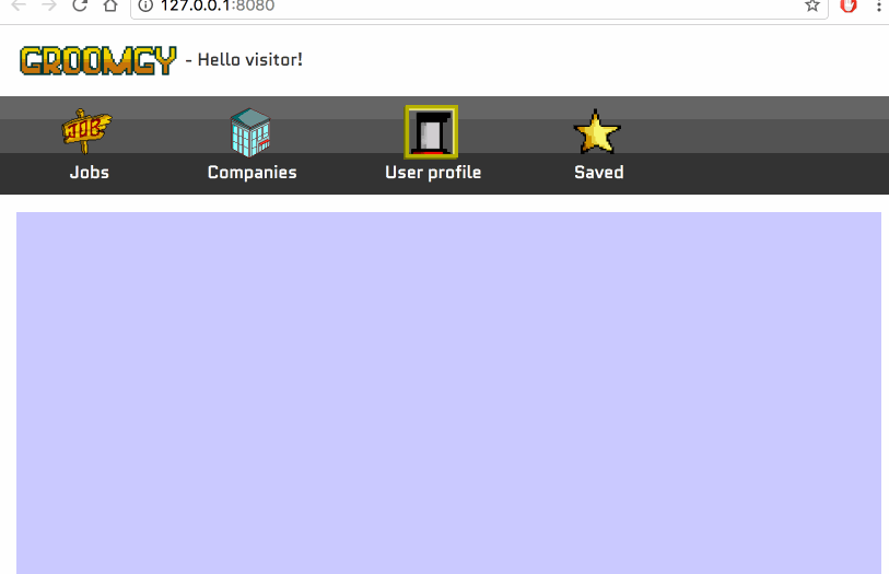
We will be creating the style for the following navbar:
1. Flexbox
Flexbox allows to control how elements are rendered in a responsive layout. We can control precisely how the space available is occupied by elements together with the order of appearance. There’s few settings for it which are applied to the container and the elements within the container.
Refer to MDN documentation if you want more explanation https://developer.mozilla.org/en-US/docs/Web/CSS/CSS_Flexible_Box_Layout/Using_CSS_flexible_boxes.
In this tutorial, I will only use the following css properties:
For the container:
1
2
display: flex;
flex-flow: row wrap;
display:flex is used to specify that the display is a flexbox and the flexbox css properties apply to it.
flex-flow is a shorthand for flex-direction flex-wrap. row means that the direction is row, it could also be column/row-reverse/column-reverse. wrap means that the flex-wrap is wrap, the elements break into multiple lines, it can also be nowrap/wrap-reverse.
And for the items:
1
flex: 1 50%;
flex is a shorthand for flex-grow flex-basis. flex-grow defines how the element occupies the space available compared to other elements and flex-basis is the initial width of the element. In this example, 1 50% means that flex-grow is 1 and flex-basis 50%.
Now that we know how to use flexboxes, we can
2. Bootstrap sass media directive
sm/md/lg are commonly used in Bootstrap for responsive design. The navbar for example has a navbar-toggleable-X where X is one of the size breakpoint. It defines at which breakpoint does the nav become toggleable.
To leverage those breakpoints, we can directly use Bootstrap sass directives in our own sass. To do that we first start by getting the source code of boostrap v4:
1
bower install bootstrap#v4.0.0-alpha.6
Now that we have boostrap sass source files, we will be able to use the media query breakpoints via the sass mixins like so:
1
2
3
4
5
6
.my-class {
    /* default style up to sm */
    @include media-breakpoint-up(sm) {
        /* style from sm */
    }
}
Which will translate to the following media query:
1
2
3
4
5
6
7
8
.my-class {
    /* default style up to sm */
}
@media (min-width: 576px) {
    .my-class {
        /* style from sm */
    }
}
3. Build the responsive navbar
Now that we know how flexboxes work and how to use Bootstrap mixins, we can build the responsive navbar we saw in the preview.
We start by the html:
1
2
3
4
5
6
7
8
9
10
11
12
13
14
15
16
17
18
19
20
21
22
23
24
25
26
27
28
29
30
31
32
<nav class="navbar navbar-toggleable-sm navbar-light bg-faded fixedsticky fixedtop">
    <button class="navbar-toggler navbar-toggler-left" type="button" data-toggle="collapse" data-target="#navbarSupportedContent" aria-controls="navbarSupportedContent" aria-expanded="false" aria-label="Toggle navigation">
        <span class="navbar-toggler-icon"></span>
    </button>

    <a href="#" class="hidden-md-up ml-auto"><img src="content/icon.png" class="brand-img" /></a>

    <div class="collapse navbar-collapse" id="navbarSupportedContent">
        <div class="navbar-nav mr-auto">
            <div class="navbar-nav-button">
                <img src="content/job_sign.png" class="brand-img" />
                <br/>
                <a class="" href="#">Jobs</a>
            </div>
            <div class="navbar-nav-button">
                <img src="content/office_building.png" class="brand-img" />
                <br/>
                <a class="" href="#">Companies</a>
            </div>
            <div class="navbar-nav-button">
                <img src="content/job_seeker_portrait.png" class="brand-img" />
                <br/>
                <a class="" href="#">User profile</a>
            </div>
            <div class="navbar-nav-button">
                <img src="content/star.png" class="brand-img" />
                <br/>
                <a class="" href="#">Saved</a>
            </div>
        </div>
    </div>
</nav>
Notice that we have a brand icon which gets hidden when higher than md thanks to hidden-md-up.
For the nav menu, we set it as navbar-toggleable-sm meaning it toggle on small screen sm.
navbar-nav-button is a custom style which we are going to define now:
1
2
3
4
5
6
7
8
9
10
11
12
13
14
15
16
17
18
19
20
21
22
.navbar-nav {
    flex-flow: row wrap;
    width: 100%;
    max-width: 400px;
    margin: auto;

    .navbar-nav-button {
        flex: 1 50%;
        text-align: center;
        padding: .5em;

        @include media-breakpoint-up(sm) {
            flex: 1 auto;
            padding: 0;
        }
    }

    @include media-breakpoint-up(sm) {
        max-width: 600px;
        margin: 0;
    }
}
navbar-nav is the css class styling for the toggleable menu. By default the direction is row and when toggled becomes column.
In our example, we have same size icons buttons therefore having all the buttons in a column would be a waste of space. Having those in a 2x2 grid would be better.
In order to do that we force the flow to remain row accross all screen sizes and order the content to break line when space is not available by setting the flex-wrap to wrap,
1
flex-flow: row wrap;
And specify that each item takes 50% of the space by default by setting the flex basis to 50%.
1
flex: 1 50%;
On screens larger than small devices, we keep the items to flex: 1 auto which will make the row occupy the whole available space.
Bootstrap nav is by default display:flex, therefore we do not need to specify it.
Also remember also to add the webkit and ms compatibility properties.
And we are done, we have created a responsive navbar with a 2x2 grid layout on small screens!
Conclusion
Today we saw how to leverage flexboxes to create a 2x2 grid for a nav menu. Flexboxes allows us to layout elements in a easy and lightweight way. We also saw how to leverage Bootstrap mixins in SASS and use the media query mixin to handle responsive layout in the same manner as Bootstrap. Lastely we put everything together in a navbar example. Hope you liked this post! If you have any questions, leave it here or hit me on Twitter @Kimserey_Lam. See you next time!
Other post you will like
- How to make a sticky navbar with Bootstrap v4 - https://kimsereyblog.blogspot.sg/2017/03/how-to-make-sticky-navbar-using.html
- Setup code to work with SASS effortlessly - https://kimsereyblog.blogspot.sg/2017/03/setup-vscode-to-work-with-sass.html
- Post form data to webserver from HTML or JS - https://kimsereyblog.blogspot.sg/2017/02/post-form-data-to-server.html
- Get your own domain name and setup SSL with Cloudfare - https://kimsereyblog.blogspot.sg/2016/08/get-your-domain-name-and-setup-ssl-with.html