Sticky Navbar For Bootstrap
Today I will demonstrate one way to achieve a sticky navbar in Bootstrap v4 using fixedsticky.
- Get the librairies
- Page without the nav sticking
- Make the nav stick
1. Get the librairies
As mentioned in the introduction, we will be using fixedsticky and bootstrap v4. We start first by getting those via bower:
1
bower install bootstrap#v4.0.0-alpha.6
1
bower install filament-sticky
You should then have it locally in your bower folder.
2. Page without the nav sticking
We build a sample page without sticky.
1
2
3
4
5
6
7
8
9
10
11
12
13
14
15
16
17
18
19
20
21
22
23
24
25
26
27
28
29
30
31
32
33
34
35
36
37
38
39
40
41
42
43
44
45
46
47
<!DOCTYPE html>
<html>
<head>
    <meta charset="utf-8">
    <title>Example</title>
    <link rel="stylesheet" href="bower_components/bootstrap/dist/css/bootstrap.css" />
    <style>
        .content {
            background-color: rgba(0, 0, 255, 0.21);
            height: 2000px;
            margin: 1em;
        }
    </style>
</head>
<body>
    <div class="text-center display-1 banner bg-faded">
        Hero banner<br/>Some image or something
    </div>
    <nav class="navbar navbar-toggleable-md navbar-light bg-faded">
        <button class="navbar-toggler navbar-toggler-right" type="button" data-toggle="collapse" data-target="#navbarSupportedContent" aria-controls="navbarSupportedContent" aria-expanded="false" aria-label="Toggle navigation">
            <span class="navbar-toggler-icon"></span>
        </button>
        <a class="navbar-brand" href="#">Navbar</a>
        <div class="collapse navbar-collapse" id="navbarSupportedContent">
            <ul class="navbar-nav mr-auto">
                <li class="nav-item active">
                    <a class="nav-link" href="#">Home <span class="sr-only">(current)</span></a>
                </li>
                <li class="nav-item">
                    <a class="nav-link" href="#">Link</a>
                </li>
                <li class="nav-item">
                    <a class="nav-link disabled" href="#">Disabled</a>
                </li>
            </ul>
            <form class="form-inline my-2 my-lg-0">
                <input class="form-control mr-sm-2" type="text" placeholder="Search">
                <button class="btn btn-outline-success my-2 my-sm-0" type="submit">Search</button>
            </form>
        </div>
    </nav>
    <div class="content"></div>
    <script src="bower_components/jquery/dist/jquery.min.js"></script>
    <script src="bower_components/tether/dist/js/tether.min.js"></script>
    <script src="bower_components/bootstrap/dist/js/bootstrap.min.js"></script>
</body>
</html>
I took the navbar straight from bootstrap examples and added a top banner of the same color of the nav and a fake container. When we scroll down we can see, as expect, that the banner and header go out of the viewport.
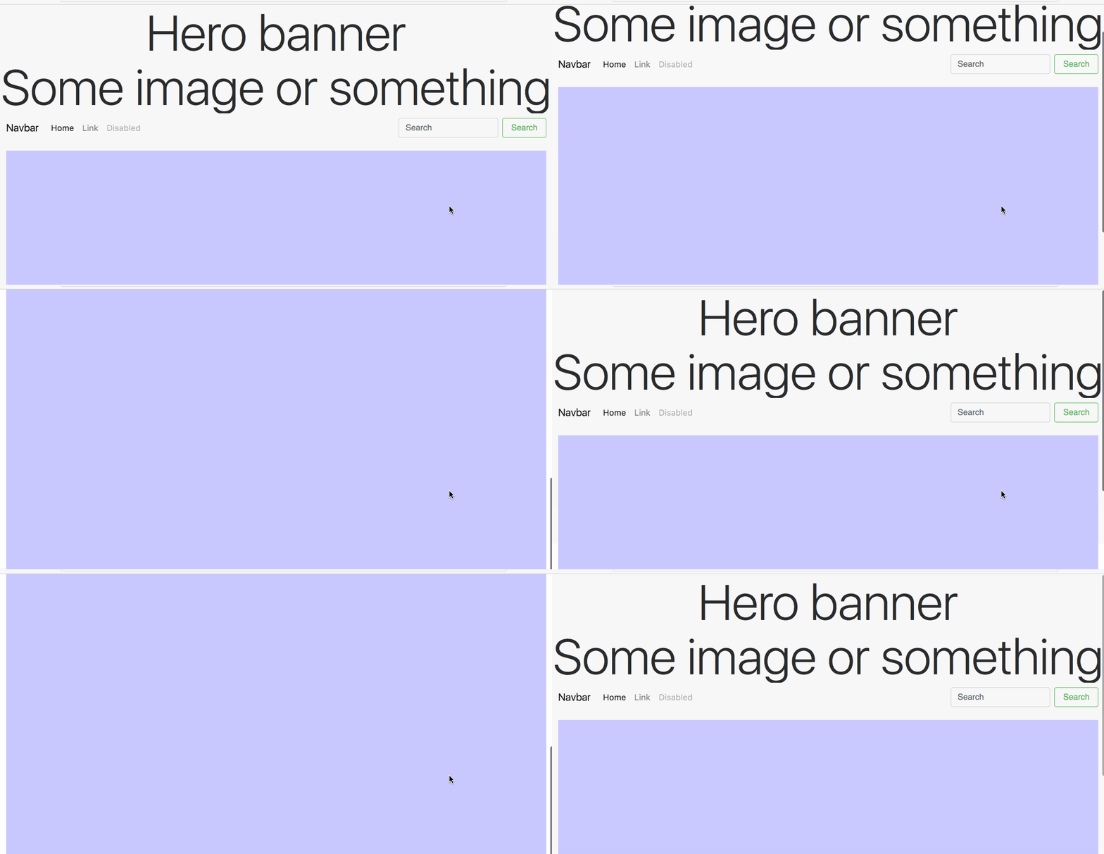
What we want is to have the nav to remain on the viewport.
3. Make the nav stick
To use fixed sticky all we need to do is use the css and js provided:
1
2
<link rel="stylesheet" href="bower_components/filament-sticky/fixedsticky.css" />
<script src="bower_components/filament-sticky/fixedsticky.js"></script>
And add the fixed sticky class to the nav together with some position style:
1
2
3
4
5
6
<style>
    .fixedtop {
        top: 0;
        z-index: 10;
    }
</style>
1
2
3
<nav class="navbar navbar-toggleable-md navbar-light bg-faded fixedsticky fixedtop">
...
</nav>
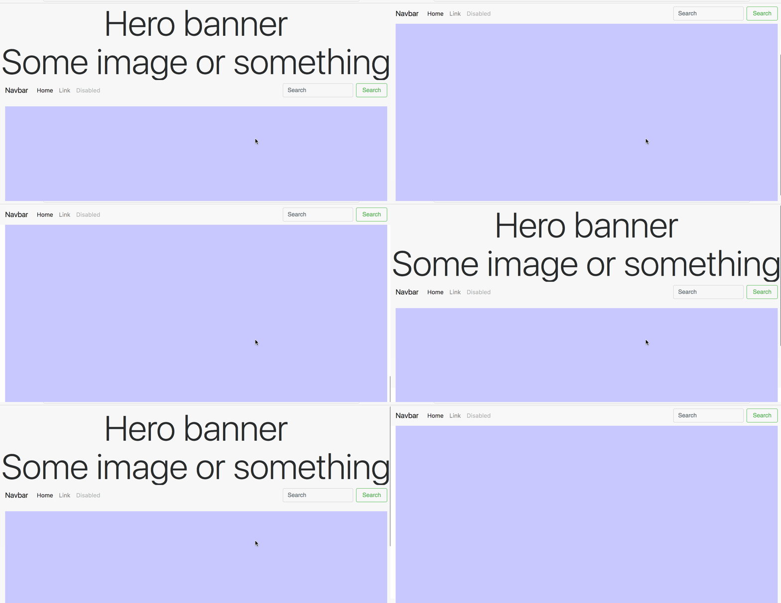
Now when we scroll we get the nice effect of the banner disappearing leaving the nav sticking at the top of the viewport.

The full code page is available on my GitHub.
Conclusion
Today we saw how we could produce a nice scrolling effect by sticking the nav to the top. Hope you liked this post, if you have any question leave it here or hit me on Twitter @Kimserey_Lam. See you next time!
