Angular Inline Form With Primeng


Inline form are used to edit portion of long forms. This makes the process of editing a long form less tedious and less error prone as the focus is on a small portion. The process of allowing the fields to be editable can be hard as the state of the field currently selected for editing needs to be tracked and the right input fields must be shown. Angular offers convenient directives to handle showing and hiding elements, together with ngrx store to handle the state and PrimeNg UI components, it is an ideal solution to build inline forms. In this post we will see how to build a user friendly form.
- Build a diplay of segmented forms data
- Build the segmented forms
- Bind the display edit buttons to the forms displays
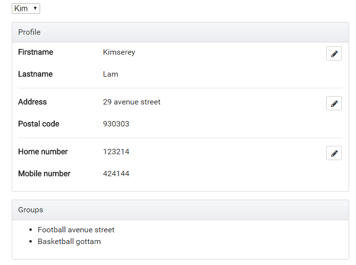
This is a preview of what we will be building:
The full source code is available on my GitHub.
1. Build a diplay of segmented forms data
For the form we will be using Bootstrap, PrimeNg and FontAwesome. Bootstrap provides universally known css classes. PrimeNg provides components for Angular like button, accordions, panels or datatables. In this example we will be using it to use a button with icon. FontAwesome is a dependency of PrimeNg used for icons.
In most cases, we have a group of properties constituting an object. Let’s take for exampple a User profile which contains the following properties:
- Firstname
- Lastname
- Address
- Postal code
- Home number
- Mobile number
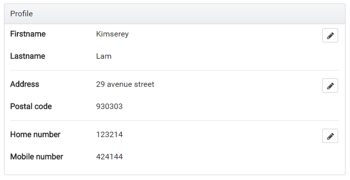
In order to provide the best user experience for our users, we will implement an inline form. We start first by defining groups of properties which make sense to be changed together, for example firstname/lastname would be together, address/postal code would be together and finally the numbers would be together.
We then build the form and add a clear separation between the groups with <hr/>.
The separation also allow us to add a floating right edit button beside each section without making the display too cluttered.
1
<button pButton type="button" icon="fa-pencil" class="ui-button-secondary" (click)="toggleEdit('name')"></button>
We end up with the following html:
1
2
3
4
5
6
7
8
9
10
11
12
13
14
15
16
17
18
19
20
21
22
23
24
25
26
27
28
29
30
31
32
33
34
35
36
37
38
39
<p-panel header="Profile">
    <div class="row mb-3">
        <div class="col-sm-3"><strong>Firstname</strong></div>
        <div class="col-sm-7"></div>
        <div class="col-sm-2 text-right">
            <button pButton type="button" icon="fa-pencil" class="ui-button-secondary" (click)="toggleEdit('name')"></button>
        </div>
    </div>
    <div class="row mb-3">
        <div class="col-sm-3"><strong>Lastname</strong></div>
        <div class="col-sm-9"></div>
    </div>
    <hr/>

    <div class="row mb-3">
        <div class="col-sm-3"><strong>Address</strong></div>
        <div class="col-sm-7"></div>
        <div class="col-sm-2 text-right">
            <button pButton type="button" icon="fa-pencil" class="ui-button-secondary" (click)="toggleEdit('address')"></button>
        </div>
    </div>
    <div class="row mb-3">
        <div class="col-sm-3"><strong>Postal code</strong></div>
        <div class="col-sm-9"></div>
    </div>
    <hr/>

    <div class="row mb-3">
        <div class="col-sm-3"><strong>Home number</strong></div>
        <div class="col-sm-7"></div>
        <div class="col-sm-2 text-right">
            <button pButton type="button" icon="fa-pencil" class="ui-button-secondary" (click)="toggleEdit('number')"></button>
        </div>
    </div>
    <div class="row mb-3">
        <div class="col-sm-3"><strong>Mobile number</strong></div>
        <div class="col-sm-9"></div>
    </div>
</p-panel>
We have the data displayed and have the edit buttons but those don’t do anything yet. Next we will be building the individual forms for each group of fields.
2. Build the segmented forms
As we can see from the picture we have 3 separated pieces which we can build form for.
In order to have a good way to find files, we can place the forms under a /profile folder under /components.
We have defined 3 groups; address, name and number.
1
2
3
4
5
6
/components
 - /profile
    - profile-address.ts (will contain the form for address)
    - profile-name.ts (will contain the form for name)
    - profile-number.ts (will contain the form for number)
    - profile.ts (will contain the display of the overall form)
To build the forms we will be using reactive forms. If you aren’t familiar with it, I suggest you take a look at one of my previous blog post on how to use Reactive form with Angular.
For the group name, we define two controls firstname and lastname and create two inputs under a group:
1
2
3
4
5
6
7
8
9
10
11
12
13
14
15
16
17
18
<form [formGroup]="form" (ngSubmit)="submit()" class="p-3 bg-faded">
  <div class="form-group row">
    <label for="firstname" class="col-sm-3 col-form-label"><strong>Firstname</strong></label>
    <div class="col-sm-9">
      <input id="firstname" type="text" class="form-control" formControlName="firstname" />
    </div>
  </div>
  <div class="form-group row">
    <label for="lastname" class="col-sm-3 col-form-label"><strong>Lastname</strong></label>
    <div class="col-sm-9">
      <input id="lastname" type="text" class="form-control" formControlName="lastname" />
    </div>
  </div>
  <div class="text-right">
    <button pButton type="button" class="ui-button-info" icon="fa-times" label="Cancel" (click)="cancel()"></button>
    <button pButton type="submit" class="ui-button-success" icon="fa-floppy-o" label="Save" [disabled]="!form.valid"></button>
  </div>
</form>
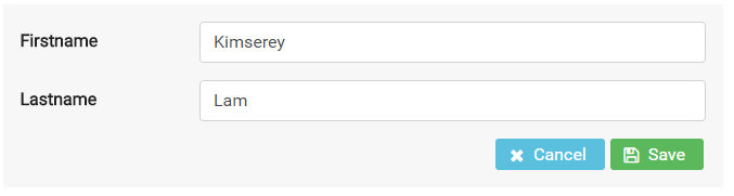
We use Bootstrap grid classes to inline the form, add padding with p-3 and apply a faded background with bg-faded.
Next we can build the component which backs the form HTML:
1
2
3
4
5
6
7
8
9
10
11
12
13
14
15
16
17
18
19
20
21
22
23
24
export class ProfileNameComponent implements OnInit {
  @Input() defaultFirstname: string;
  @Input() defaultLastname: string;
  @Output() submitForm = new EventEmitter<ProfileName>();
  @Output() cancelForm = new EventEmitter<void>();
  form: FormGroup;

  constructor(private fb: FormBuilder) { }

  ngOnInit() {
    this.form = this.fb.group({
      firstname: [this.defaultFirstname, Validators.required],
      lastname: [this.defaultLastname, Validators.required]
    });
  }

  submit() {
    this.submitForm.emit(this.form.value);
  }

  cancel() {
    this.cancelForm.emit();
  }
}
We initialize the form in ngOnInit with the default inputs.
We also define two function, submit and cancel which are used in the respective buttons.
We now have a working form component to change the firstname and lastname of the user. What is left to do is to display the form when in edit mode and display the data when in view mode.
View vs Edit mode will be decided by an editedField value which we will store in the state inside the ngrx store.
This component can pretty much be copied over for every forms.
For now let’s pretend that we have it and simply add the condition to show or hide the displayed data and form:
1
2
3
4
5
6
7
8
9
10
11
12
13
14
15
16
17
18
19
  <div *ngIf="editedField !== 'name'">
    <div class="row mb-3">
      <div class="col-sm-3"><strong>Firstname</strong></div>
      <div class="col-sm-7"></div>
      <div class="col-sm-2 text-right">
        <button pButton type="button" icon="fa-pencil" class="ui-button-secondary" (click)="toggleEdit('name')"></button>
      </div>
    </div>
    <div class="row mb-3">
      <div class="col-sm-3"><strong>Lastname</strong></div>
      <div class="col-sm-9"></div>
    </div>
  </div>
  <app-profile-name *ngIf="editedField === 'name'"
    [defaultFirstname]="profile.firstname"
    [defaultLastname]="profile.lastname"
    (submitForm)="submitName($event)"
    (cancelForm)="resetEdit()">
  </app-profile-name>
*ngIf="editedField !== 'name'" prevents the data from being shown we the group name is in edit mode while *ngIf="editedField === 'name'" shows the form in edit mode.
Now in order to have it hide and show the way the preview demonstrates, we will need to add editedField in to the state.
3. Bind the display edit buttons to the forms displays
This example start from the previous ngrx store guard tutorial, therefore the whole ngrx structure is already built. If you wish to know more you can check my previous post on ngrx store or Angular guard.
We start by adding the editedField to the State and the initialState.
1
2
3
4
5
6
7
8
9
10
11
// in reducers/user.ts

export interface State {
  ...
  editedField: string;
}

export const initialState: State = {
  ...
  editedField: null
};
Next we can define an action EDIT_FIELD which will be used to specify the state change.
1
2
3
4
5
6
7
8
9
10
11
12
13
// in actions/user.ts

export const EDIT_FIELD = '[User] Edit Field';

export class EditFieldAction implements Action {
  readonly type = EDIT_FIELD;

  constructor(public payload: string) { }
}

export type Actions
  = ...
  | EditFieldAction;
After that the reducer function can handle the edited field change:
1
2
3
4
5
6
7
8
9
10
11
12
13
14
15
16
export function reducer(state = initialState, action: user.Actions) {
  switch (action.type) {

    ...

    case user.EDIT_FIELD: {
      return Object.assign({}, state, {
        editedField: action.payload
      });
    }

    default: {
      return state;
    }
  }
}
Finally we can expose the selectors from reducers/user:
1
export const getEditedField = (state: State) => state.editedField;
Then the barrel reducers/index.ts:
1
export const getUserEditedField = createSelector(getUserState, fromUser.getEditedField);
After that we can extract the edited field inside the container which will use the profile container.
1
2
3
4
5
6
7
8
9
10
11
12
13
14
15
16
17
18
19
20
21
22
23
24
25
26
@Component({
  selector: 'app-user-profile',
  template: `
    <app-profile
      [profile]="profile$ | async"
      [editedField]="editedField$ | async"
      (changeEditedField)="changeEditedField($event)">
     </app-profile>
  `,
  styles: []
})
export class ProfileContainer implements OnInit {
  profile$: Observable<Profile>;
  editedField$: Observable<string>;

  constructor(private store: Store<fromRoot.State>) { }

  ngOnInit() {
    this.profile$ = this.store.select(fromRoot.getUserProfile);
    this.editedField$ = this.store.select(fromRoot.getUserEditedField);
  }

  changeEditedField(field) {
    this.store.dispatch(new user.EditFieldAction(field));
  }
}
We pass in the profile and edited field and handle the changeEditedField event.
Finally we complete the implementation by handling all form submit form the Profile component and emiting on changeEditedField for the container to catch up when edit is toggled.
1
2
3
4
5
6
7
8
9
10
11
12
13
14
15
16
17
18
19
20
21
22
23
24
@Component({
  selector: 'app-profile',
  templateUrl: 'profile.html',
  styles: []
})
export class ProfileComponent {
  @Input() profile: Profile;
  @Input() editedField: string;
  @Output() changeEditedField = new EventEmitter<string>();

  submitName(name: ProfileName) { }

  submitAddress(name: ProfileAddress) { }

  submitNumber(name: ProfileNumber) { }

  toggleEdit(field) {
    this.changeEditedField.emit(field);
  }

  resetEdit() {
    this.changeEditedField.emit(null);
  }
}
And that’s it, the same methodology can be followed to build the rest of the form. The full source code is available on my GitHub. https://github.com/Kimserey/ngrx-store-sample.
Conclusion
Today we saw how we could use ngrx store to maintain the state of an inline form edited field. Building inline form requires more work as multiple forms need to be built instead of a single big mess. Although more time is required to get it out, I highly believe that the improvement in user experience provided largely outweigh the time cost. Hope you enjoyed this post as much as I enjoyed writing it. If you have any questions, leave it here or hit me on Twitter @Kimserey_Lam. See you next time!