Client Side Validation Angular

Two years ago we looked into Angular Reactive Forms Part 1 and Part 2, explored different ways of adding controls and binding the values of the controls to a reactive form using standard HTML controls and PrimeNG controls. But we left aside another important part of the creation of a form, the validation. There are two types of validation, a server side validation which hits the server to execute some hosted logic, and a client side, inline, validation which can be used to directly validate simple constraints directly on the frontend. In today’s post we will look at how we can implement a nice inline validation for our reactive forms in Angular.
Reactive Form
We will be creating a simple form to demonstrate our validation. We start first by adding the Reactive module to our main module:
1
2
3
4
5
6
7
8
9
10
import { ReactiveFormsModule } from '@angular/forms';

@NgModule({
  imports: [
    // other imports ...
    ReactiveFormsModule
  ],
  // other configs
})
export class AppModule { }
The reactive form module provides facilities to build forms. In this post we will be using the FormBuilder, FormGroup, FormControl and Validators.
Next we create a component where we create a from:
1
2
3
4
5
6
7
8
9
10
11
12
13
14
15
16
17
18
19
20
21
import { Component } from '@angular/core';
import { FormBuilder, FormGroup, Validators } from '@angular/forms';

@Component({
  templateUrl: 'create-hero.component.html'
})
export class CreateHeroComponent {
  form: FormGroup;

  constructor(private fb: FormBuilder) {
    this.form = fb.group({
      name:         ['', [Validators.required]],
      description:  ['', [Validators.required]],
      category:     [0, [Validators.required]]
    });
  }

  submit() {
    console.log(this.form.value);
  }
}
We start by injecting the FormBuilder which we use to create a FormGroup. A FormGroup groups a set of FormControl which will be connected to the HTML form build in the HTML template. We define three inputs for our form, a name, a description and a category where we use Validators to add an inline validation on the inputs. Here required.
Next we build the template:
1
2
3
4
5
6
7
8
9
10
11
12
13
14
15
16
17
18
19
20
21
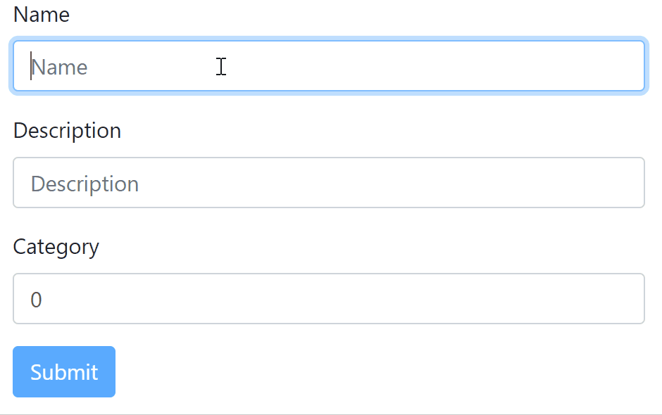
<div class="container my-3">
<form (ngSubmit)="submit()" [formGroup]="form">
<div class="form-group">
<label for="name">Name</label>
<input id="name" class="form-control" type="text" placeholder="Name" formControlName="name" />
</div>
<div class="form-group">
<label for="description">Description</label>
<input id="description" class="form-control" type="text" placeholder="Description"
formControlName="description" />
</div>
<div class="form-group">
<label for="category">Category</label>
<input id="category" class="form-control" type="number" placeholder="Category" formControlName="category" />
</div>
<button type="submit" class="btn btn-primary" [disabled]="!form.valid"">Submit</button>
</form>
</div>
Bootstrap classes are used for the form and we will be using the style for the inputs and input text helper.
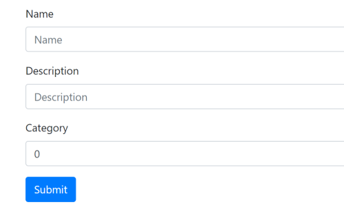
Now that we have the form built, we can see that the bindings from the template to our form property in the component work as expected.
We can see that the button is disabled when a validation is failing. That’s thanks to our disabled condition checking if the form is not valid with !form.valid. There are three states a control can be in, valid, invalid and pending. Pending happens when asynchronous validators are used, a control will be in pending while it is being validated. Therefore for the submit button we disable for any other state than valid.
That’s good but we don’t have much indication of which field the issue is coming from. The form is disabled but we don’t really know why. In the next section, we will see how we can use the FormControl in our advantage to provide more details to the form.
Form Control
The form is built from a form group. Each element within the form group is a form control which can be accessed via the #.get([name]) function of the form group.
So what we can do is provide getters to directly access each form controls from the template:
1
2
3
4
5
6
7
8
9
10
11
get name() {
  return this.form.get('name');
}

get description() {
  return this.form.get('description');
}

get category() {
  return this.form.get('category');
}
Then using this getters we can display precise information about the fields.
We start by highlighting inputs that have errors. We do that using the [ngClass] directive which takes a dictionary of css class as key and boolean as value specifying whether the class is active or not.
1
<input id="name" class="form-control" [ngClass]="{ 'is-invalid': name.invalid }" type="text" placeholder="Name" formControlName="name" />
We are able to use #.invalid from the form control thanks to the getter name we added. When the control is invalid, the input will have the class is-invalid which will highlight the input:
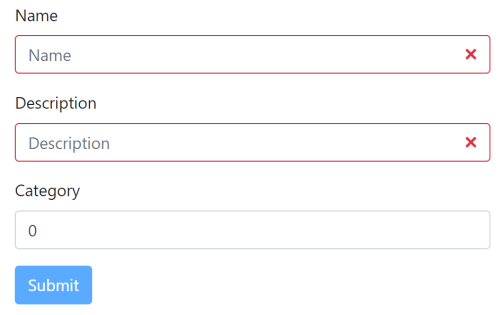
The required validator is self explanatory in the template. When the input is red, we can directly understand that we forgot to complete the field.
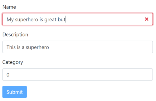
But if we add another validator, like a maxLength,
1
2
3
4
5
this.form = fb.group({
  name:         ['', [Validators.required, Validators.maxLength(20)]],
  description:  ['', [Validators.required]],
  category:     [0,  [Validators.required]]
});
the input will become invalid without a good explanation for our users.
To fix this, we can use the #.errors member from the form control which contains all current errors and create dedicated messages based on the validation error present on the control.
1
2
3
4
5
6
7
8
<div class="form-group">
  <label for="name">Name</label>
  <input id="name" class="form-control" [ngClass]="{ 'is-invalid': name.invalid }" type="text" placeholder="Name" formControlName="name" />
  <div class="invalid-feedback" *ngIf="name.errors">
    <div *ngIf="name.errors.required">Specify a name.</div>
    <div *ngIf="name.errors.maxlength">The name can't exceed 20 characters.</div>
  </div>
</div>
The key maxlength can be found on the description of the validator in the type file:
1
A validator function that returns an error map with the `maxlength` property if the validation check fails, otherwise `null`.
With that in place, we will have a clear way of indicating problems to our users by adding two descriptive error messages:
1
2
3
4
<div class="invalid-feedback" *ngIf="name.errors">
  <div *ngIf="name.errors.required">Specify a name.</div>
  <div *ngIf="name.errors.maxlength">The name can't exceed 20 characters.</div>
</div>
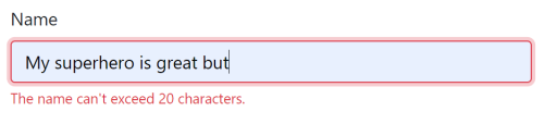
Similarly all other validators will have their error present in #.errors dictionary with their respective key.
Form Control State
If you followed along, you would have noticed that the fields are considered invalid as soon as the page is displayed. It is normal after all since there are missing values. But our validation highlighting will display errors before our users even have the chance to start typing something. To fix that we can include a check using the control boolean state #.touched.
Touched will be true when a blur event will have occurred on the field, meaning that focus will have been on the input prior.
1
2
3
4
5
6
7
8
<div class="form-group">
  <label for="name">Name</label>
  <input id="name" class="form-control" [ngClass]="{ 'is-invalid': name.touched && name.invalid }" type="text" placeholder="Name" formControlName="name" />
  <div class="invalid-feedback" *ngIf="name.touched && name.errors">
    <div *ngIf="name.errors.required">Specify a name.</div>
    <div *ngIf="name.errors.maxlength">The name can't exceed 20 characters.</div>
  </div>
</div>
We prevent the is-invalid class to be applied and invalid-feedback to be displayed if the input control has not been touched yet. This will prevent the errors from being displayed too prematurely.
There are other interesting state for a control which can be put into four categories:
valid/invalid/pending: we saw them in the first section, they relates to the validation, sequentially if a control is valid, or invalid, or being validated,disabled/enabled: indicates whether the input is currently disabled or enabled,pristine/dirty: indicates whether the value of an input has been changed or not,touched/untouched: as we just used to figure out whether focus/blur triggered on the control.
And we conclude today’s post by applying the same method for the rest of the fields:
Conclusion
Today we looked into client side validation in Angular. We started by creating a simple reactive form which allowed us to work efficiently with the input data from the template. Then we moved on to look at how we could use functionalities provided by the FromControl of the reactive module to display error messages and provide visual cues to our users. And we completed the post by utilizing one of the state of the control to ensure that the errors weren’t displayed prematurely. I hope you liked this post and I see you on the next one!